About
We've helped this small startup increase monthly signups by 262% within 6 months. They're a mobile application that let property owners or managers hire and schedule cleaners based in Montreal, Canada. The problem stakeholders (just the company owner and assistant) identified was a lower conversion rate from downloading the app to booking a service. The goal was to better understand why they were experiencing high drop-off rates during app enrollment, come up with redesign ideas and general UX guidance that might lower these drop-off rates while increasing usability. I was one of 3 UX Designers helping on this project contributing to the User Experience enhancements, while my peers also contributed to the UX writing and UI Visual Designs. The company has been rebranded to Cleanster.
Final Test Results
We chose to only conduct tests for ease of use and speed primarily due to time constraints, here are some key findings
- Within a week of deploying some of our recommendations (removing the map, updating text descriptions and using familiar inputs) drop-offs have decreased by 7%, they have gradually incorporated the changes so it’s easier to keep track of the metric of each change
- After 6 months the monthly signups have increased by over 262% after incorporating some of our recommendations and other updates

Pain Points
We utilized the stakeholders’ collected feedback heard from the clients as well as our analysis as a team to highlight some of the pain points before
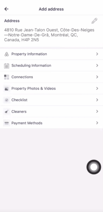
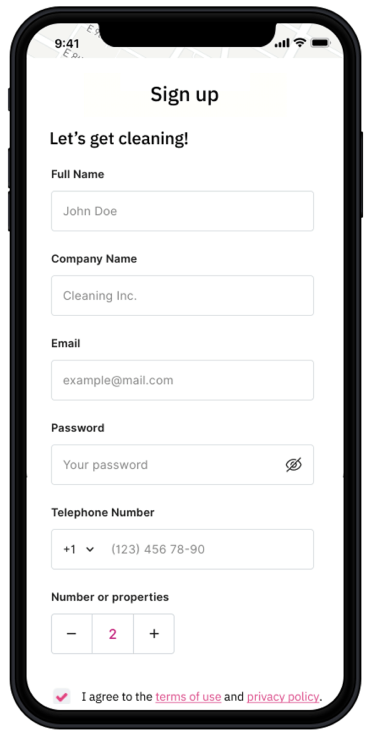
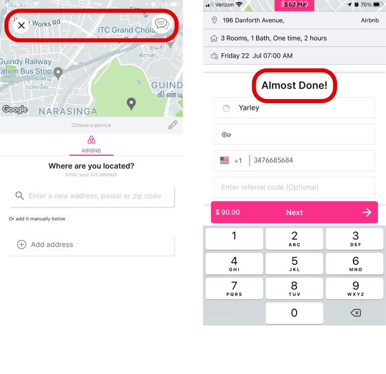
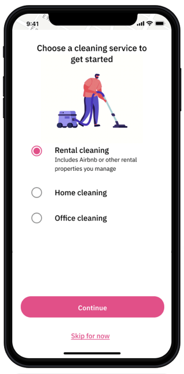
- Sign-up is buried within formal registration process
- Current
- Suggestion
- Simplify the sign up form and leave the items that need more cognitive load for later in the process such as address entry, scheduling the service and making payment for afterwards.


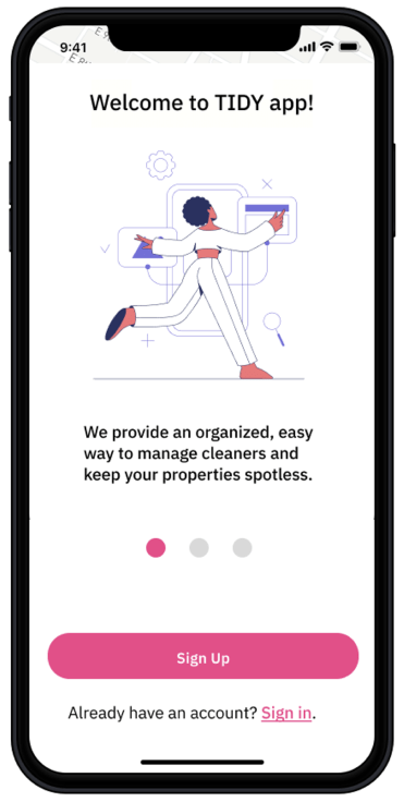
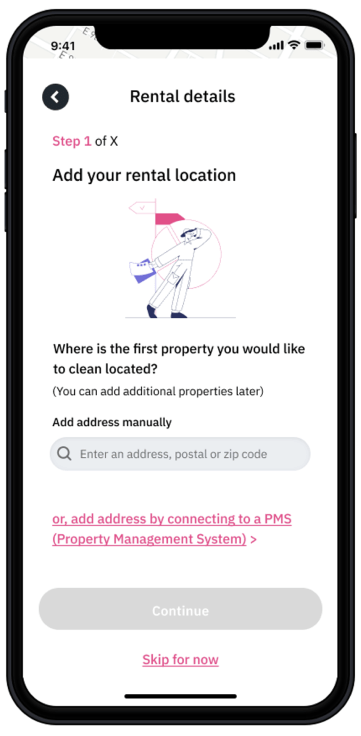
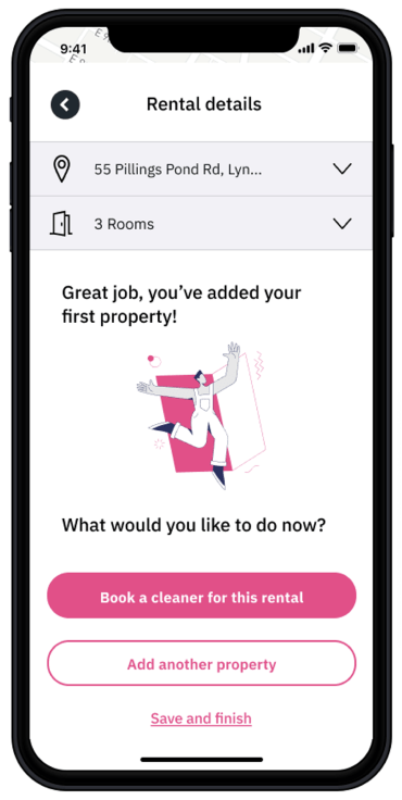
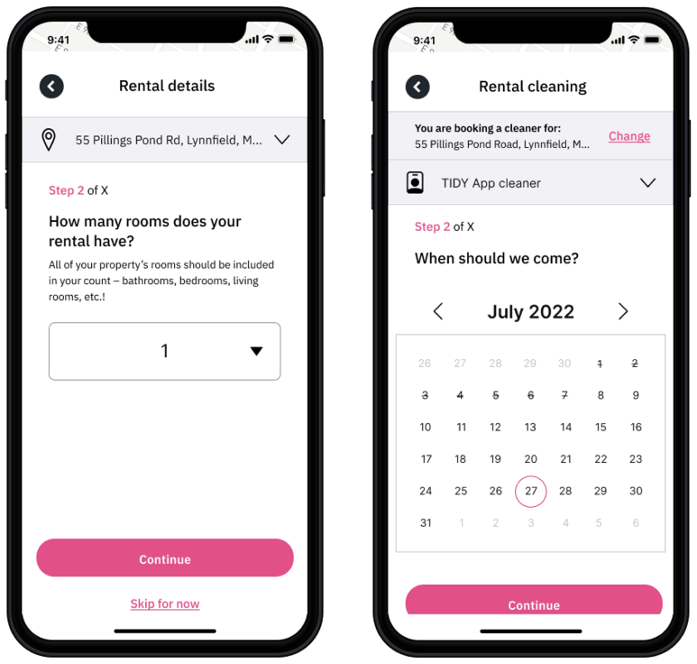
- Lack of guided onboarding process that walks new users through
- Current
- Suggestion
- Add an introduction wizard that communicates the value of the platform and why they are signing up.

- Some text was unclear and could be perceived as confusing
- Current
- Suggestion
- Providing additional descriptions to ensure things could be understood for even a 1st grader


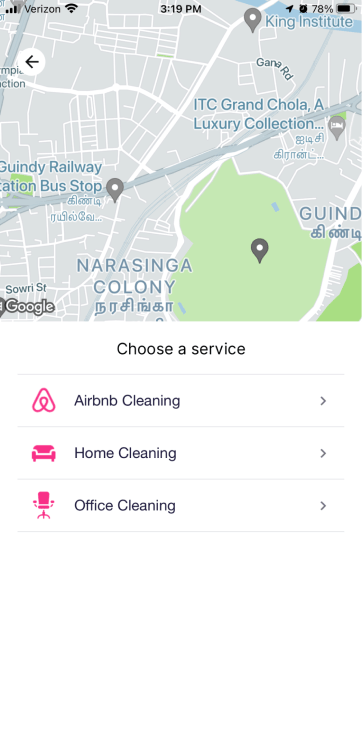
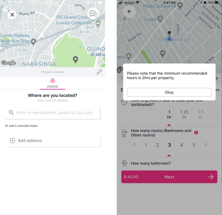
- Navigation wasn’t clear from screen to screen, where they are and how do they get back
- Current
- Suggestion
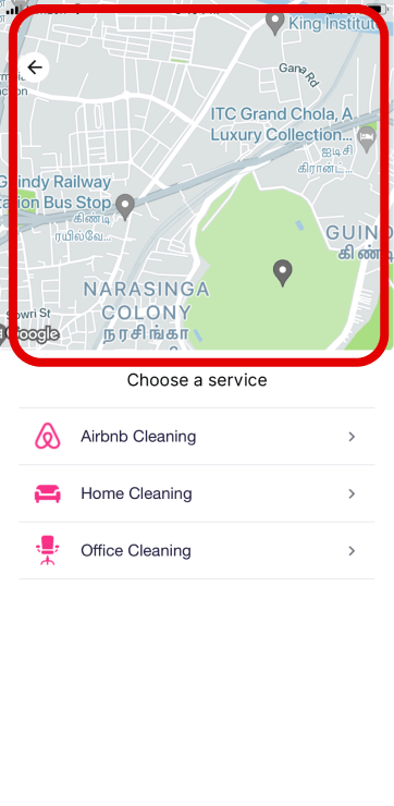
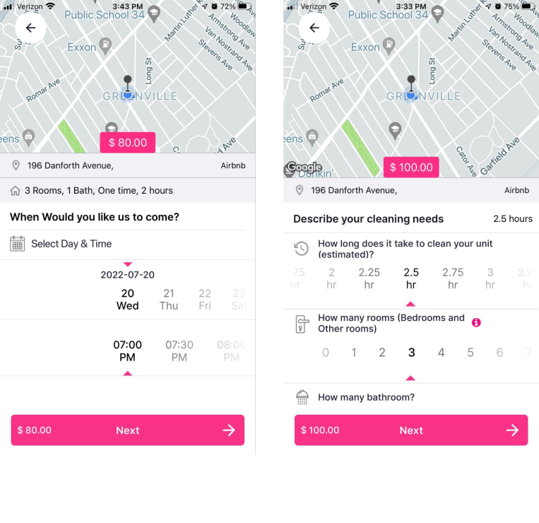
- Map wasn’t functional in the process
- Current
- Suggestion
- Remove the map, it’s not adding value to the process

- Inputs were conveyed in a non-common way which may cause confusion to users
- Current
- Suggestion
- Make inputs as simple using native style controls according to WCAG 2.1 AA guidelines for the address, hours, and booking date


Other Projects
CE Vision
Financial Web App
Research • Strategy • UI • UX Design
Enhanced the searching experience for Investors, Hedgefunds and Corporations to view existing and predictive AI insights on consumer spending+50% of users were able to achieve ideal search results fasterProxyVote Mobile
Financial Mobile App
Research • Strategy • UI • UX Design
Shipped Broadridge's first native iOS and Android application that increased engagement and participation from shareholders to vote for their proxy1st mobile app developed for Broadridge, boosting engagement with younger audiences