Overview
This case study focuses on developing a solution for wealth management professionals to streamline their access to client insights and opportunities. The product evolved from concept to a minimum viable product (MVP) that provides real-time insights and visualizations, enabling faster and more accurate decision-making.
Problem Statement
Wealth management professionals were reliant on development teams and vendors to gather client data, which was delivered in fragmented Excel files stored across multiple locations. This process required manual consolidation, making it time-consuming, prone to errors, and inefficient for identifying actionable opportunities.
My Role
I led the UX strategy, research, and design for this project, driving it from initial discovery to the launch of a fully functional MVP.
Impact
- Launched MVP with little to no usability issues due to following a true human-centered UX process
- Customized business reports delivered in seconds versus weeks without need for development intervention
- Can visualize data to tell a story in seconds versus hours of manual excel labor
- Can identify business performance trends in seconds
How we started?
We started by mapping the current processes and user journeys, honing in on a specific use case: acquiring virtual advisor clients—individuals with liquid assets ranging from $50,000 to $499,000. Our goal was to understand the steps users took to achieve this objective and identify the pain points and opportunities within their workflow through a 1-on-1 interview.
Pain points
- Manual Data Consolidation – Users had to continuously merge and add columns across multiple Excel spreadsheets to make the data meaningful, leading to inefficiencies and errors.
- Outdated Data – Shareworks data relied on manual developer efforts and was often stale, lacking real-time accuracy.
- Cumbersome Salesforce Updates – Updating client financial information in Salesforce required a manual upload process, further complicating the workflow and increasing the risk of errors.
Opportunities
We identified the potential to streamline the data process by automating the cleaning, consolidation, and customization of data. This would allow users to tailor the information to their needs and access it seamlessly through an intuitive UI, enabling them to make informed decisions more efficiently.
Digging in further with Personas
We created personas for the first time by conducting user interviews across different user groups. This process helped us identify distinct personas, each with unique goals, pain points, and opportunities. By understanding these diverse perspectives, we ensured our solution addressed the varying needs and workflows of all relevant user groups.

Strategy moving forward
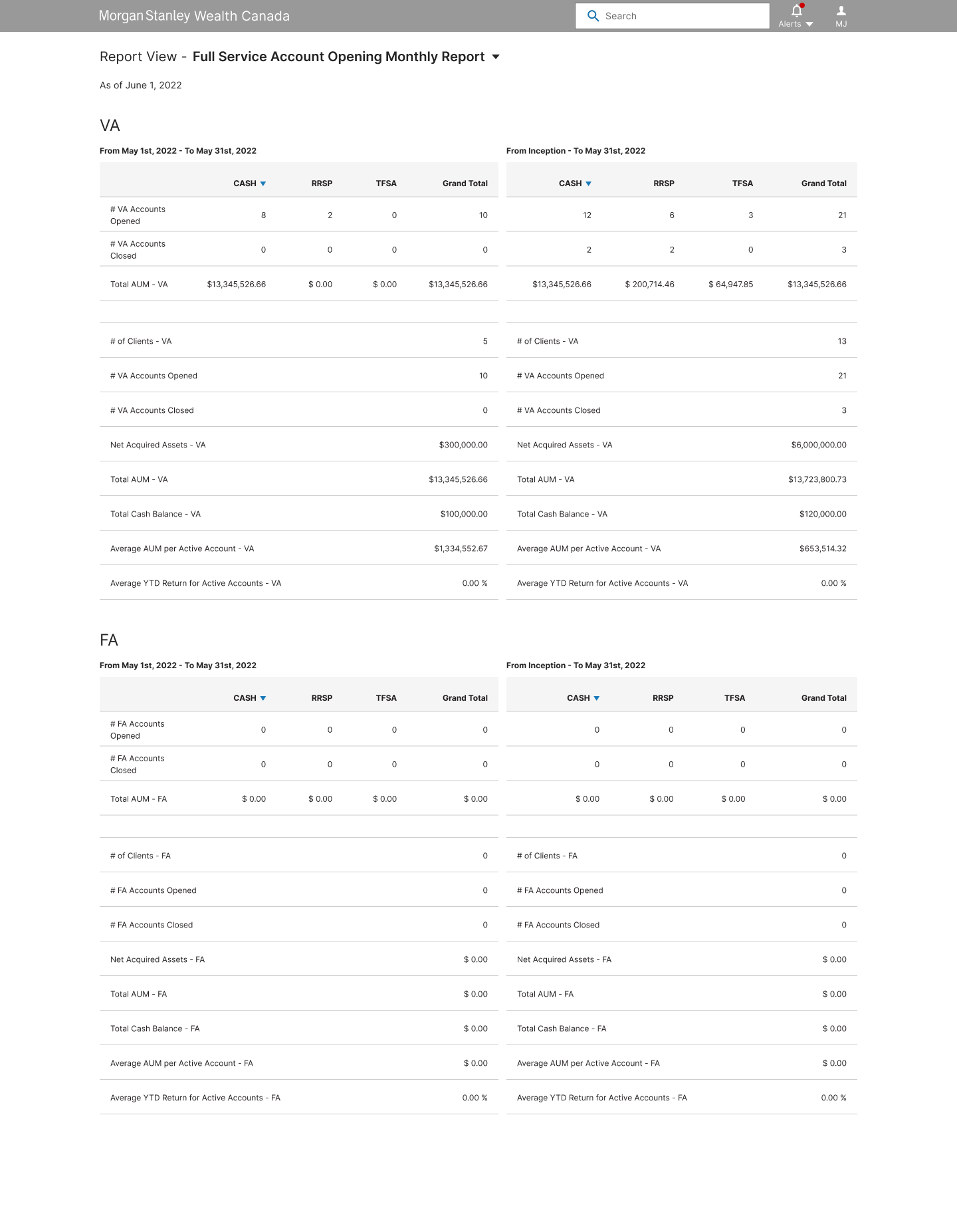
With only a few months to complete the designs, we focused on delivering a feasible MVP that addressed the essential business needs. The solution was designed to be scalable, laying the foundation for a suite of wealth management products tailored to internal strategic business users and financial or branch managers. The business decided to focus only on FA (Financial Advisor) and VA (Virtual Advisor) data.
- User Identification – Collaborated with the business team to identify key users, enabling us to design for both the MVP and near-term goals while thoroughly understanding their processes, pain points, needs, and desires.
- Iterative Design Approach – Developed concepts based on research findings and iterated continuously to craft an intuitive user experience, focusing on optimal data layout, presentation, visualization, navigation, and basic customization controls.

Wireframe Ideations
We began sketching layouts based on our hypothesis of how users want to search for and extract data, ensuring alignment with their mental models and behaviors. A critical focus was on creating an intuitive information architecture that supported accurate and efficient filtering. Users’ primary goal was to compare data from specific periods—such as weeks, months, or quarters—against data from inception (the beginning of time).
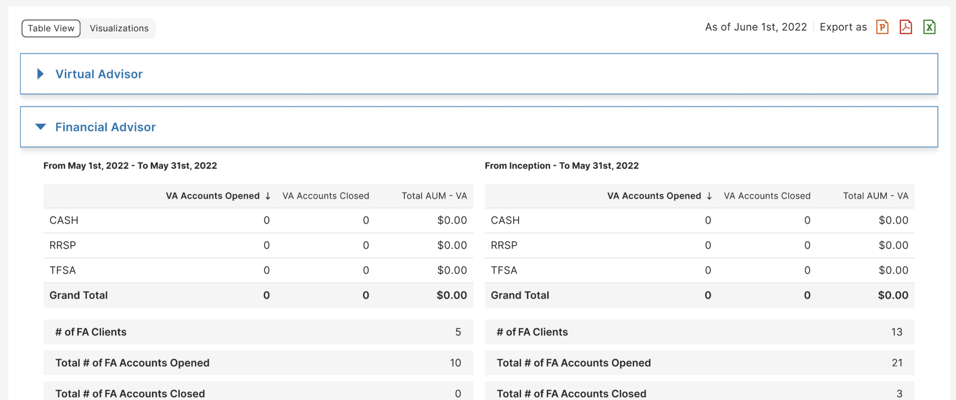
- A – Grouped and Stacked Comparison (Side-by-Side) – Financial Advisor (FA) and Virtual Advisor (VA) data were grouped and stacked on top of each other, with date range comparisons displayed side-by-side between the left and right sides of the layout.

- B – Segmented Summary and Side-by-Side Comparison – Financial Advisor (FA) and Virtual Advisor (VA) data were segmented, starting with a summary of each, stacked on top of one another. Date range comparisons were maintained side-by-side between the left and right sides.
- C – Single Table Column Comparison – Financial Advisor (FA) and Virtual Advisor (VA) data were grouped and stacked together, with date range comparisons displayed in a single table, aligned as adjacent columns for easier cross-referencing.
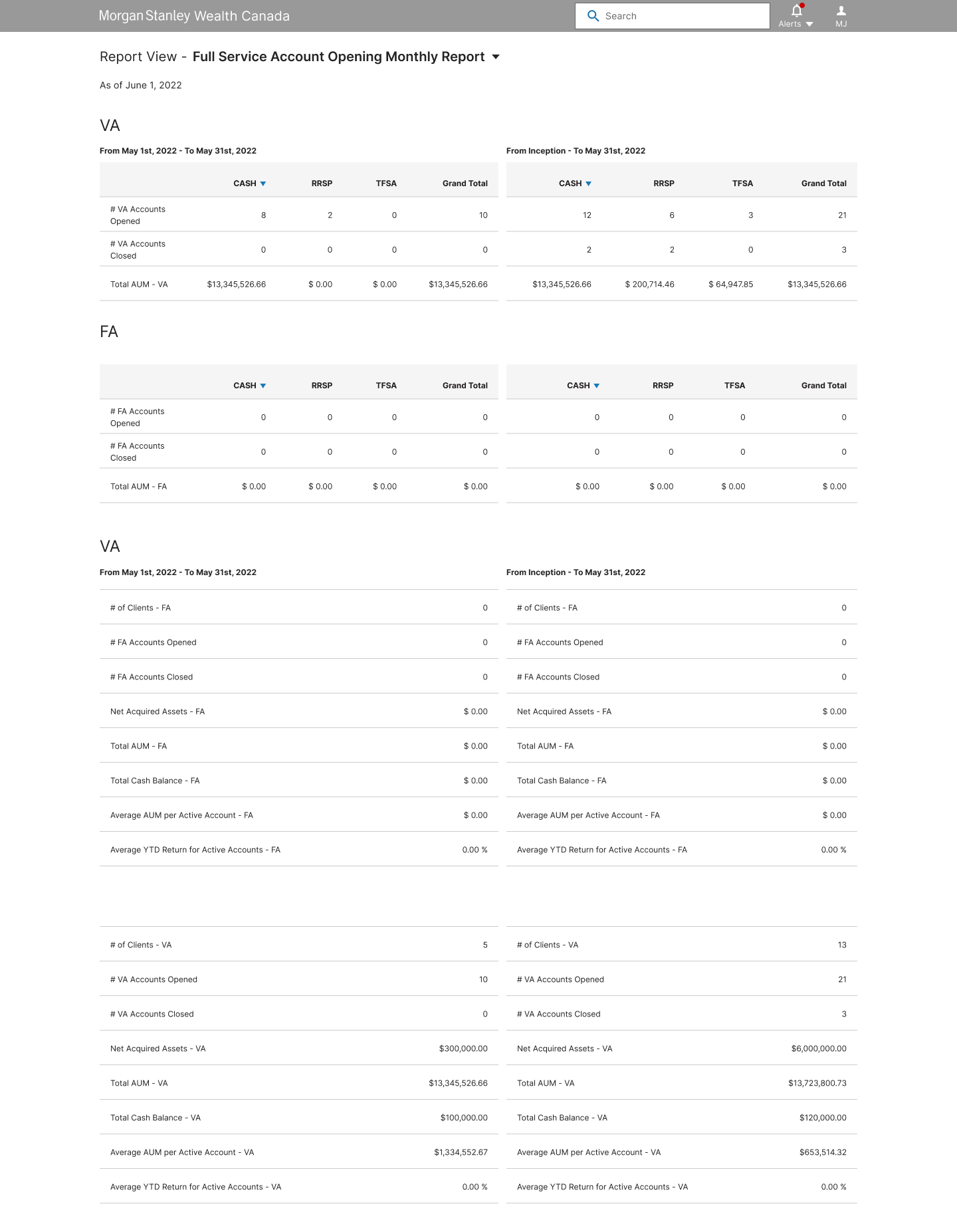
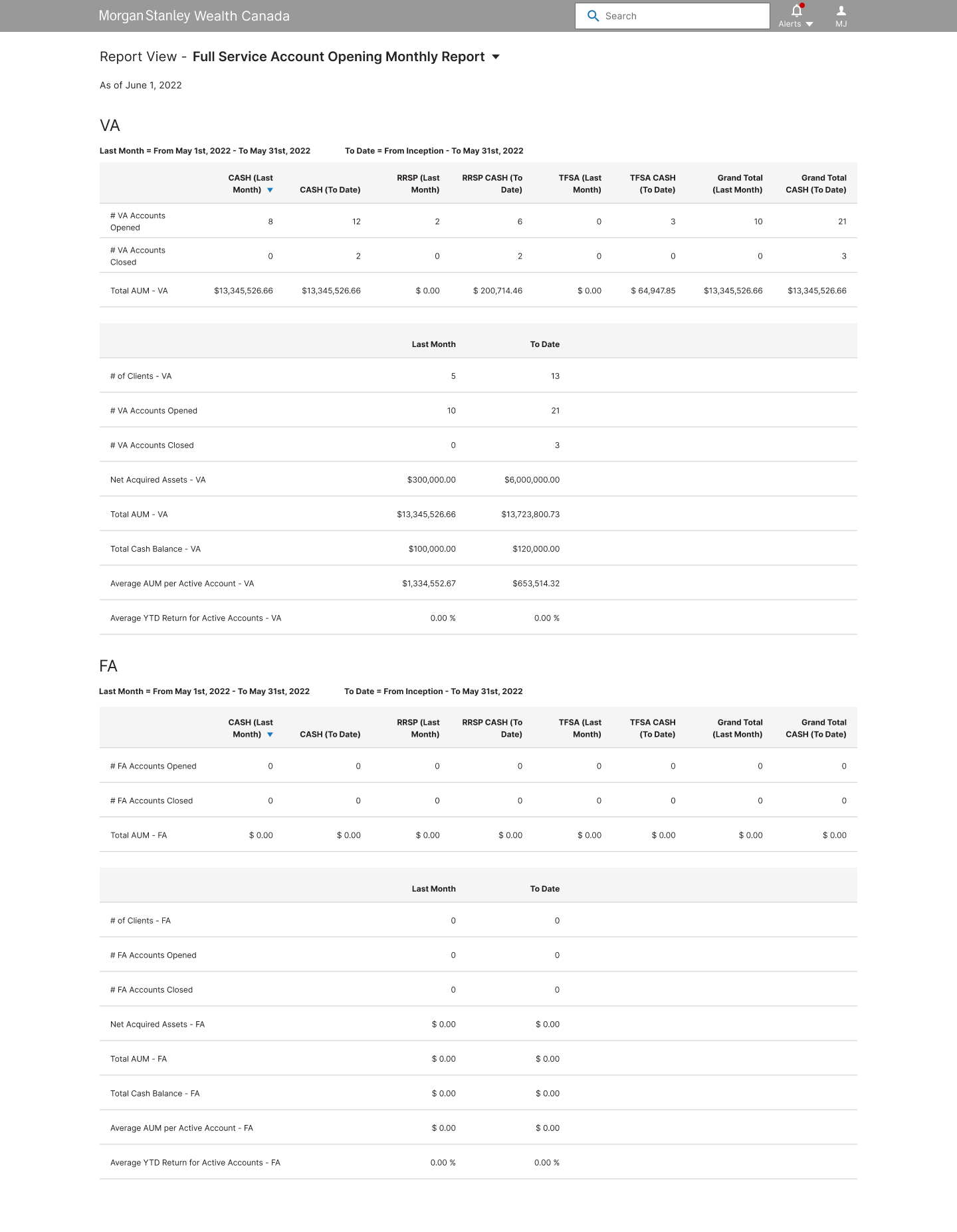
Users and product stakeholders preferred Version A for its readability and ease of data digestion. Based on their feedback, we decided to further refine and develop designs using this approach.
Interactive Design Solution
We brought the design to life by incorporating interactive elements, prioritizing filters and key features through an MVP lens. These features were crafted based on user requirements, ensuring users could seamlessly access the latest and most relevant data while visualizing it effectively. The design was iteratively tested in stages, allowing us to refine each component and converge on a final, user-centric solution.

Features
- For the MVP, we grouped the FA ($500K+ liquid asset accounts) and VA ($50K–$499K liquid asset accounts) data into a single tab. This decision was based on user behavior, as these accounts are closely monitored for their higher revenue potential to the firm. Additionally, for MSAD accounts, which followed a different growth strategy, an opening grouped report was created. This allowed business strategists to view these accounts by the companies sponsoring them, aligning with their specific needs.

- Each tab was equipped with filters tailored to the specific needs of users. For example, in the first tab, users could compare data across two time periods—a key goal identified during research. This feature provided users with the flexibility to perform these comparisons independently, eliminating the need to rely on development teams or third-party data hosts for manual data requests.

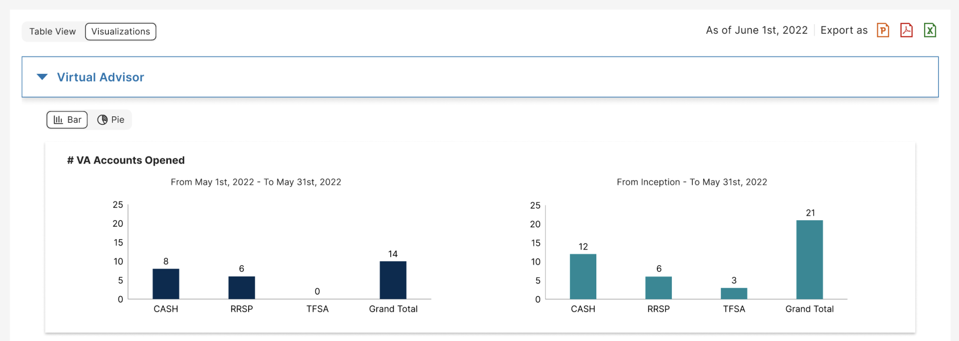
- Users were given the option to view data in both tabular and visualization formats. User testing revealed mixed preferences: some users favored visualizations for specific insights, while others preferred tables for detailed analysis. Both formats were ultimately deemed equally important, as they catered to diverse user needs and supported various analytical goals. An interesting finding emerged during testing—when presented with a pie chart visualization, half of the users found it particularly useful. As a result, we included it as an additional visualization option.

- Users were provided with the ability to export data in three presentable formats—PowerPoint, PDF, and Excel. This feature was designed to support meeting preparations and reporting needs, allowing users to seamlessly share insights in their preferred format.

- We implemented the ability to switch between FA and VA data using tabs, expandable/collapsible sections, and simple headers. Through user testing, we analyzed behavior patterns and reactions, finding that users preferred scrolling with the option to condense data as needed. This flexibility allowed them to navigate and interact with the data more efficiently.

- As an enhancement to the pie chart feature, we introduced calculated insights to display the upward or downward differences between the two date ranges. This provided users with clear, actionable comparisons at a glance and was highly appreciated during user testing.


Summary
I truly enjoyed working with this team, who embraced and trusted me with the UX process over time. While it required some initial education and managing pushback, we developed a strong, collaborative relationship. I was privileged to work closely with users in an iterative process, and together, we built a scalable, modular system that seamlessly accommodated new enhancements as they were added.

- Human-Centered and Accessible Design – By following a true human-centered design process and integrating accessibility guidelines, the product achieved high usability and adoption soon after launch. This approach ensured the solution met user needs effectively while delivering an intuitive and inclusive experience.
- Collaboration with Developers – Worked closely with the development team, including a skilled Angular developer, to address gaps in Morgan Stanley’s less mature design system at the time. Leveraging my development background, I conducted visual QA and implemented experience and CSS adjustments to streamline changes, ensuring a polished final product.
- Educating the Team on the UX Process – The team was new to the UX process and initially believed it aligned directly with agile methodologies. I clarified that UX requires a slower, more deliberate approach at the start to ensure thorough research and design for the MVP. Once the MVP launched, we transitioned to a more agile framework for adding new functionalities and features.
- Post-MVP Enhancements – After the MVP launch, we introduced several new functionalities to further streamline data access and reduce reliance on development intervention. These included code mapping of contracts to financial advisors for billing, mapping transactions for accurate payments, viewing account details by year or financial advisor, and generating reports for fund managers.
Other Projects
ProxyVote Mobile
Financial Mobile App
Research • Strategy • UI • UX Design
Shipped Broadridge's first native iOS and Android application that increased engagement and participation from shareholders to vote for their proxy1st mobile app developed for Broadridge, boosting engagement with younger audiencesInternational Wealth Management
Financial Web App
Research • Strategy • UI • UX Design
Designed a new internal platform that eliminated dependency on development and vendor efforts to get insightful and visualizations to manage and grow an investment bank's assets+7 days of manual labor saved per session to get actionable insights