About
Strategized, researched, designed and developed a custom CMS-powered website with a team of 3 for Caleb’s Trio of Hope, an organization supporting children with palliative cancer and their families, funding research, and raising awareness. Families with sick children face big challenges, and Caleb’s Trio didn’t have one place for them to find help. Donors didn’t know how to give money safely, grant organizations had trouble choosing who to help, and hospital staff found it hard to pick the best resources. The new platform empowers their team to easily manage or update content, without any technical expertise, as well as increase grant fundings, donations and organization credibility. My team consisted of a content strategist and a full stack developer, we leverage AI as part of the research finding competitors information and some of the creatives such as colors and branding suggestions.
Impact
- Increased donors and patients engagement with the organization
- Made donations easier with pre-packaged options increasing donations by 220% Year over Year
- Eliminated manual PDF support applications by moving it to a dynamic online form
- Enhanced their online presence with search engines
- Increased the amount of grants by make it easier for organizations to verify credibility
Goals
- Provide happy experiences for children with a palliative cancer diagnosis and their families
- Provide financial and emotional support for the families of children in palliative care
- Provide funds for the research and treatment of pediatric cancer, specifically brain tumors and rare cancers
- Educate about the signs and symptoms of pediatric cancer, specifically brain tumors
- Create a website for Caleb’s trio of Hope to serve as a centralized space to achieve the goals stated above
Timeline
Strategic plan timelines with my team and stakeholders to ensure we stay on track for success

How we started?
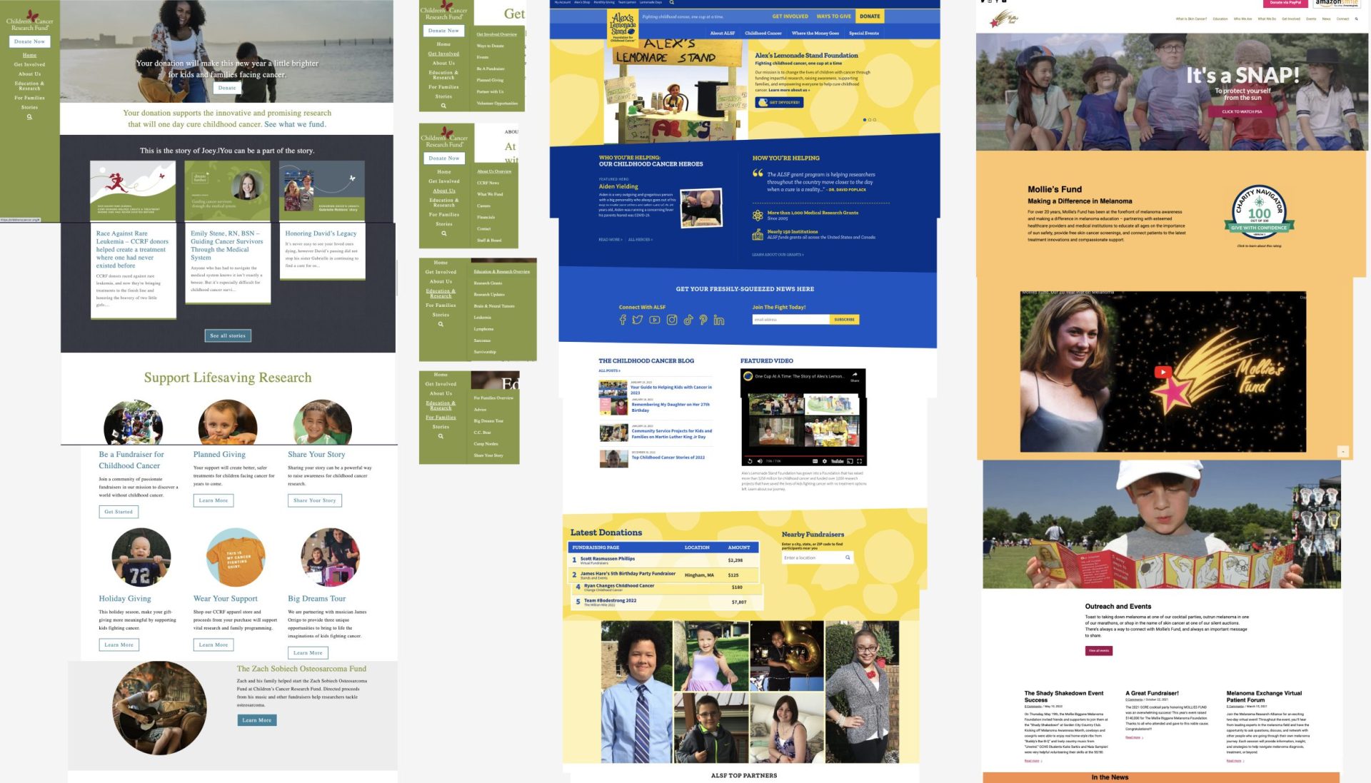
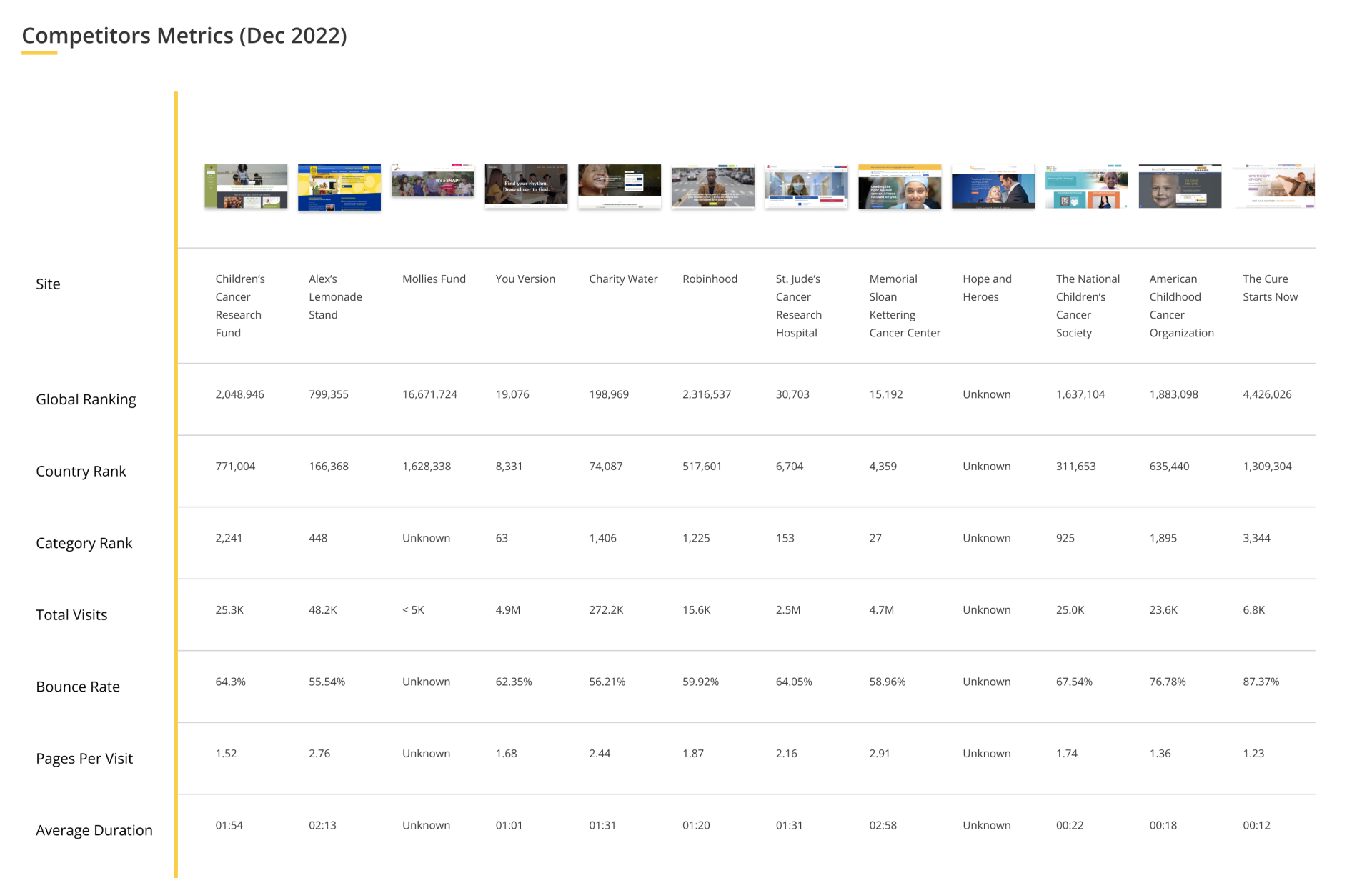
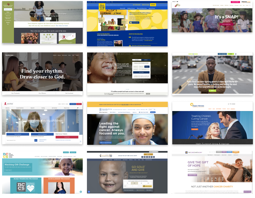
- We we were limited on research budget and time but we figured we can start by looking at relevant websites which my team, stakeholders and I were knowledgeable of to better understand what worked and done some competitors analysis. Latest data we found were of the previous year’s December’s data.
-
- We dug deeper into research of how we should create the navigation and hero section to find the following. No need to reinvent the wheel but instead our strategy was to leverage the best performing site’s navigation and hero image’s information architecture, image treatment and interactions.

- NavigationA. Good Findings from competitors home page navigation
- Having a few menu/navigation options 6-7 seems to make page clear
- Giving clear path to search
- Consistent menus -> About (9/12 sites had one), Get Involved (9/12 sites had one), Education/Learn (5/12 sites had one)
- Call to Action -> Donate (7/12 sites had one), Learn/Watch (2/12 sites had one), Get Involved (1/12 sites had one)
- Create a website for Caleb’s trio of Hope to serve as a centralized space to achieve the goals stated above
B. Weaknesses from competitors home page navigation- When there are too many sub-navigation, we’re asking the user to use more cognitive load
- No indicator of menu items with sub-navigation, usually we use a down caret or down arrow icon
- Hiding main navigation via a hamburger menu is not necessary in desktop view
- HeroA. Good Findings from competitors home page hero section
- Clear Call To Action for donate
- Use of video can create emotional connection to audience
- Understand the impact of the organization and mission in 1-2 sentences with the Call to Action
B. Weaknesses from competitors home page hero section- Transitions to different Call to Action such as “Donate”, then “Get Involved”, then “Watch” for a couple of sites felt rushed and not telling a story
- Not using slider pictures or videos at all seem to not have the highest rates of conversions and engagement
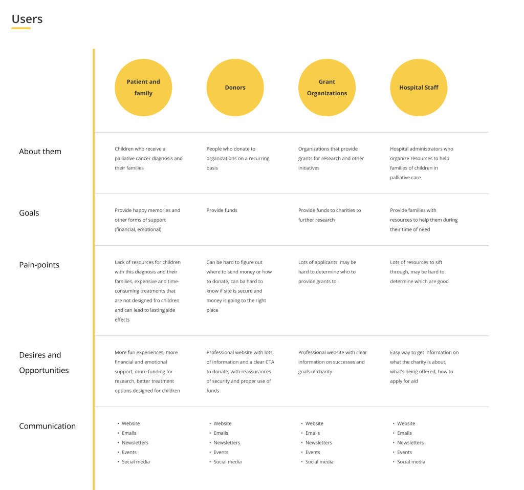
- Personas aren’t always needed however because there are multiple audiences of this website it was important to understand and know their individual goals, pain points, desires, opportunities and how they currently communicate with the brand
Wire-framing concepts
We had enough to start structuring the story of the home page, I worked closely with my content strategist, I focused on the flow and type of content while they focused more on the copy, we iterated with our stakeholders until we got it 90% right across all pages. We had mission page which would help the broader audience understand our purpose, Caleb’s story as all this was inspired by him, other children stories, educational content on the tumor and care options, board of trustees, a shop store to get promotional items, a donation page and contact page

We wanted to try something more inovative for the donate and make it feel more like an ecommerce experience where users can actually select a “product” which they can donate to. We knew wouldn’t need a full robust E-commerce shopping experience right away so integrating with a payment provide would ease the hassle.

Branding
We wanted to define main color for the site and had to look back at the meaning of some of the possible colors that can work against the logo. We fed chatGPT some information from our findings and most of these colors were its recommendations

We tested against the logo to get a sense from stakeholders which resonated the best with the brand, the yellow with the dark brown text was the most favored

Home page hero design
Since this is the “seller” section of the page, it’s important we get the copy right, photo and a fun but emotional connection

- Wanted to keep the lightness of the site but yellow isn’t an WCAG AA compliant color on its own so we found a brown that blended well for the navigation menu
- We kept the navigation fun on hover to use the yellow as background color
- Provide funds for the research and treatment of pediatric cancer, specifically brain tumors and rare cancers
- Similar to the best conversion sites we found from our research we did a carousel treatment with images to the left and description with call to action on the right
- To make it more fun and exciting we added a “wave” treatment on the hero and animate it to resemble harmonic union of the colors. We used accent colors to pull this off but with chat GPT we were about to find out accent colors. I did a sample animation in Figma to simulate its color and purpose
- To enhance the “playful” part of the hero we added some animations of shapes (stars, circles, triangles) using the accent colors and small circles with subtle opacity. We carried a simpler animation of this theme into the other pages within the header titles of each page.
CMS (Content Management System)
Once we got the core pages prototyped, our full stack developer led the architecture design of the content management system to make it easy for users to update content with out much technical knowledge. We also provided instructional website documentation with video instructions showing where and how to update or add content.

Outcome
Really happy my team and I were able to help this non profit succeed, about a year later so many grants awarded, streamlined processes for looking for care, increased awareness and digital engagement in the community of its purpose, increased donations especially with the pre-packaged items during the holiday seasons. You can help support this organization’s mission as well if you made it this far by visiting the prototype link

Other Projects
CE Vision
Financial Web App
Research • Strategy • UI • UX Design
Enhanced the searching experience for Investors, Hedgefunds and Corporations to view existing and predictive AI insights on consumer spending+50% of users were able to achieve ideal search results fasterSan Nurse Assess
Healthcare Tablet App
Research • Strategy • UI • UX Design
Made it faster for nurses to see their schedule, intake patients and sign forms while on the field on a native iOS and Android application+98% improvement in time efficiency for organizing personalized patient visit schedules