About
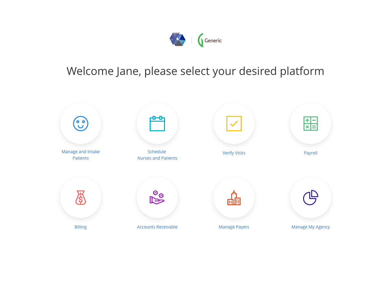
This project was to build an all in one integrated application from the ground up for Sandata Technologies, a leading U.S. provider of Home care software for payers, providers & participants delivered in a Software as a Solution (“SaaS”) model. This application is intended to be secured and accessible with a streamlined User Experience that makes it easier and quicker for agencies to manage their staff, field nurses, patients and relations with insurance providers. Below is a much shorter version of what the team and I researched and my UX process for the final solution. I was lead UX/UI Designer who also played some Business Analyst role, and I architecture a custom styled Bootstrap framework for the front end team.
Impact
We chose to only conduct tests for ease of use and speed primarily due to time constraints, here are some key findings
- How much time was saved for patient intake process? (From live observations)
- Average person took 2-3 minutes versus the 10-15 minutes from previous method.
- How likely were you able to easily find your input fields in expected places? (From survey)
- 93% accuracy using 10 random fields and asking users to find which tab it belong to. Some additional feedbacks we got was “highly improved”, “clean”
- How much time was saved to schedule patient with staff? (From live observations)
- Average person took 1-2 minutes versus the 6-8 minutes from previous system.
Presentation in Powerpoint
Pain Points
- Weren’t always sure where to find certain information
- System is too slow
- Takes too long to intake patients
Requirements
- One integrated system that’s WCAG AA 2.0 Compliant
-
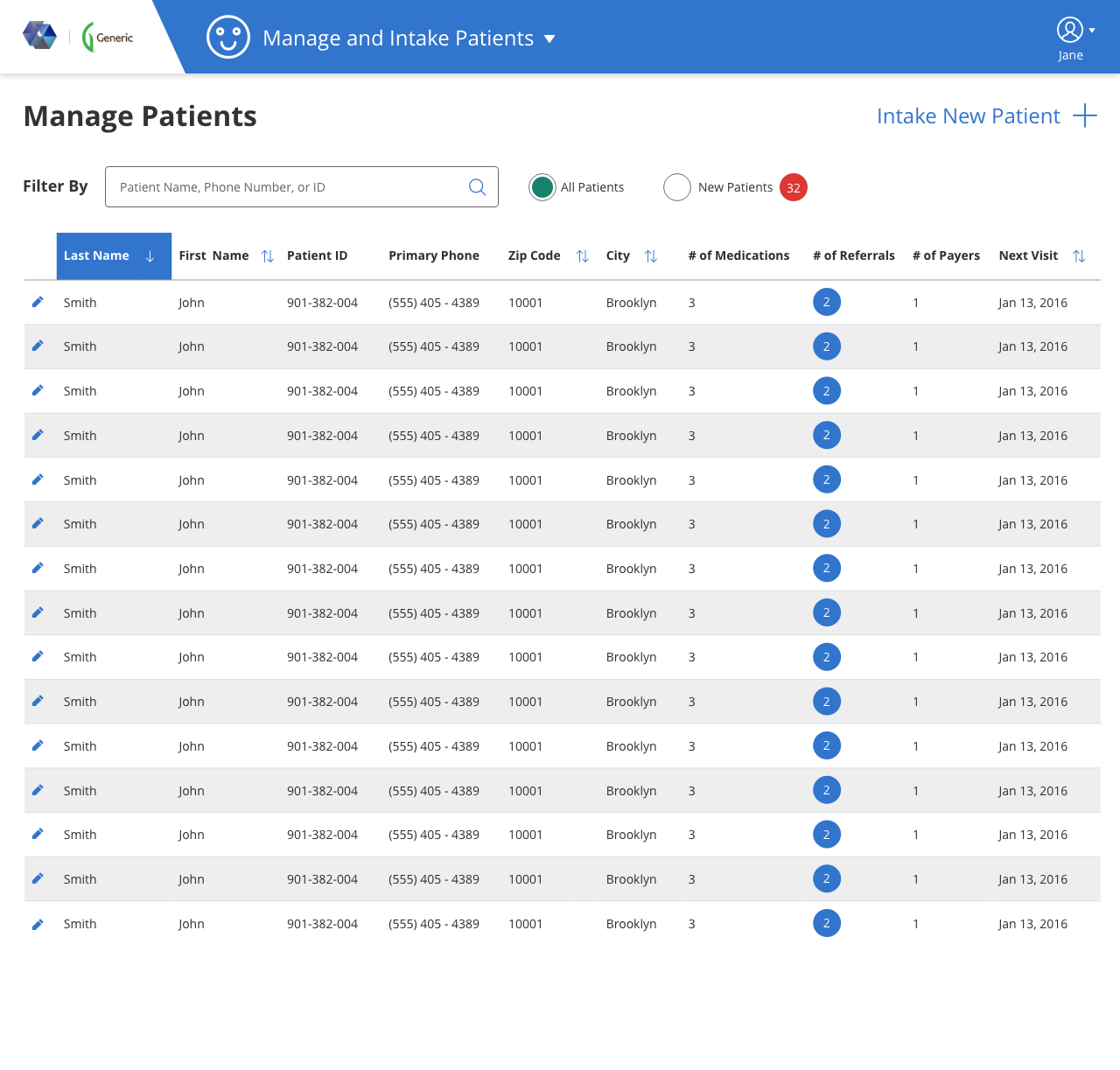
Patient System
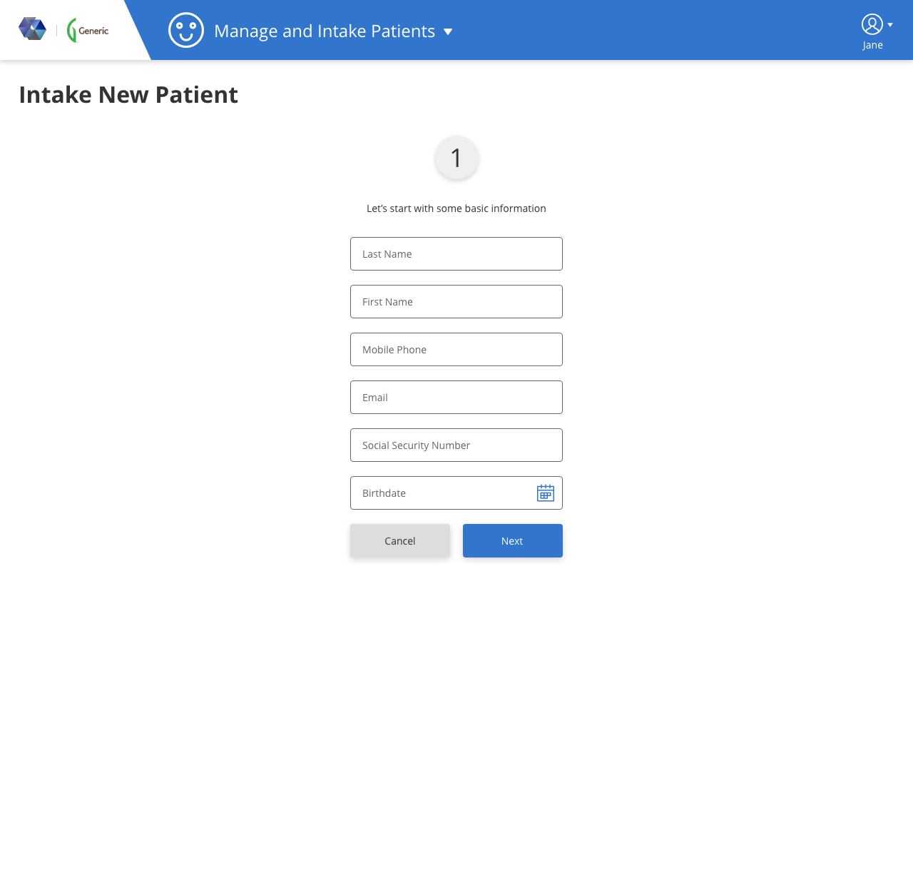
- Quicker and more effective patient intake process
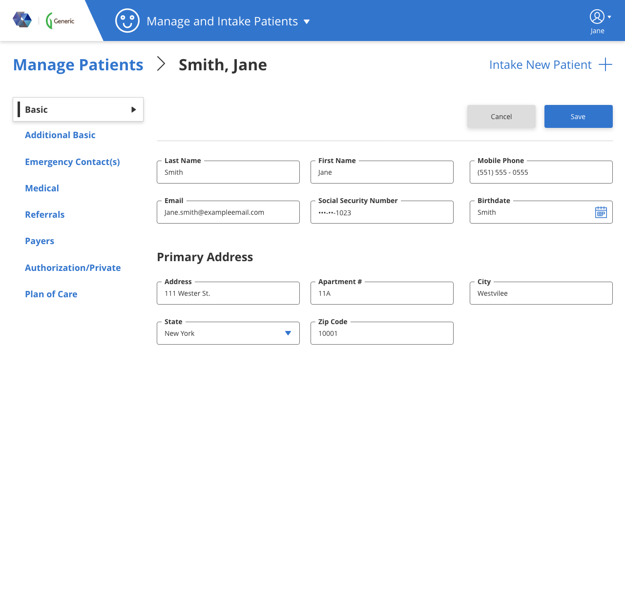
- Manage/edit patient information accordingly
- Filter patient by name, phone number, and ID
- Research and sort all my patient records as needed
-
Scheduling System
- Easily view daily and weekly schedules of staff
- Schedule patients to matching and qualified staff
-
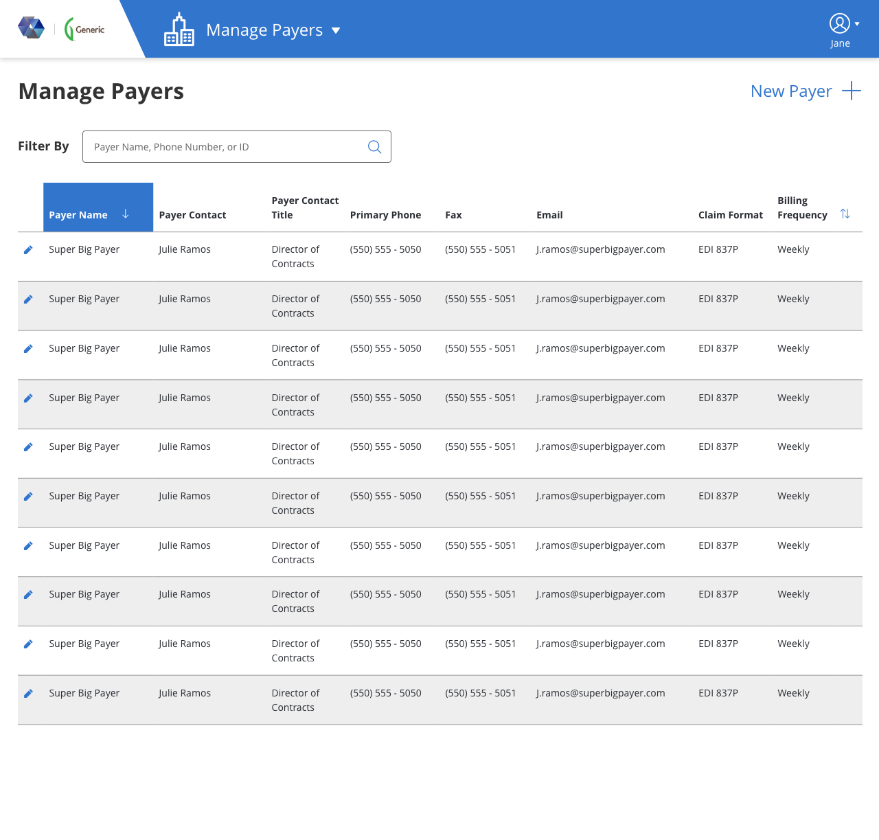
Payer Management System
- Store and Intake Payer/Insurance provider’s information
- Research and sort all payer’s records as needed
- Filter Payer by name, phone number, and ID
Information Architecture
- The Business Analysts and I recorded over 100 fields provided from SME’s who were well versed with the existing system and industry
- After being able to actually view some of the agency’s staff in action it was clearly things weren’t group according to how they actually use them, so we took some time to really concentrate on content organization
- I limited the number of fields per group to 6 for at least the intake of patient information to prevent cognitive overload
- Also spent sometime to understand definition of all the data points to regroup them according to what was the most important and absolutely required to complete the intake step as quickly as possible


User Flow


Hypothesis / Assumptions
- For the management screen, the user claimed that they needed to see as much as possible, but our brains have limitations, due to screen size I asked them for top 10 fields they wish to see with the assumption they would be more productive and quicker in their workflow
- They also thought breaking the fields in separate pages would slow them down, but I assumed it would increase speed if they’re seeing just a few fields at a time, and since it’s AA Compliant keyboard functionalities will be in full effect
- The numerical representation of Medications, Referrals and Payers wasn’t what the client was initially seeking but the actually values, but since these were dynamic and we were limited on space, I suggested the number would give them a quick read to help them figure which patient records to update.
Innovations
- Filter would be elastic instead of separated fields
- We provided a filter to quickly get to new patients, so when the remainder of the intake has to be completed the user can quickly get to it. The number of new patients was also shown so they get a preview of their expected workload.
- Integrated typeahead for certain fields using a suggested learning that grows based on all users inputs within the agency
- Scheduling now had a “matching” algorithm which only qualified staff members would match to a patient
Comp


Theme
Colors
- This application is very heavy on data so keeping a minimal 2 color theme was ideal
- We used a dark grey for all text (with a secondary lighter gray), since this application will be so information heavy, a slightly lighter black will help eye fatigue
- An accent theme color of warm blue was definitely needed to indicate a sense of calmness to the users who would be using this application, since they will be spending so much time doing repetitive tasks, we wanted to help ease any potential “frustration”
Font
- Open Sans by Google
- An easily readable modern font that conveys numbers and text was best choice
- Some pages will require read only text, so needed a font with a strong contrast between bold and normal so readonly text and their labels could be distinguished
Buttons
- Keeping a business look and feel to this application was very important, with small corner radius
- At least twice the padding in height so button size stood out
Other Projects
San Nurse Assess
Healthcare Tablet App
Research • Strategy • UI • UX Design
Made it faster for nurses to see their schedule, intake patients and sign forms while on the field on a native iOS and Android application+98% improvement in time efficiency for organizing personalized patient visit schedulesProxyVote Mobile
Financial Mobile App
Research • Strategy • UI • UX Design
Shipped Broadridge's first native iOS and Android application that increased engagement and participation from shareholders to vote for their proxy1st mobile app developed for Broadridge, boosting engagement with younger audiences