Skip to successes (case studies)
Go back Go back

San Agency Center

I designed an all-in-one SaaS platform for home health agencies, from the ground up for Sandata, that cut patient intake from 10–15 minutes to 2–3 and scheduling from 6–8 minutes to 1–2.

Overview

I designed an integrated application from the ground up for Sandata Technologies, a leading U.S. provider of home care software for payers, providers and participants, delivered as SaaS. It's secure, accessible and fast, making it easier for agencies to manage staff, field nurses, patients and insurance providers. As lead UX/UI designer, I also took on part of the business analyst role and architected a custom Bootstrap framework for the front-end team.

Key outcomes

With a tight timeline, I focused testing on ease of use and speed. The results:

2–3 min intake

2–3 min intake

Average patient intake, down from 10–15 minutes (live observations)

93% accuracy

93% accuracy

Placing 10 random fields in the right tab. Users called it “highly improved” and “clean” (survey)

1–2 min scheduling

1–2 min scheduling

Average time to schedule a patient with staff, down from 6–8 minutes (live observations)

Presentation

Pain points

Hard to find information

Users weren't sure where to look for the information they needed.

A slow system

The system was too slow, holding up everyday work.

Lengthy patient intake

Patient intake took 10–15 minutes per patient.

Requirements

  • One integrated system, WCAG 2.0 AA compliant
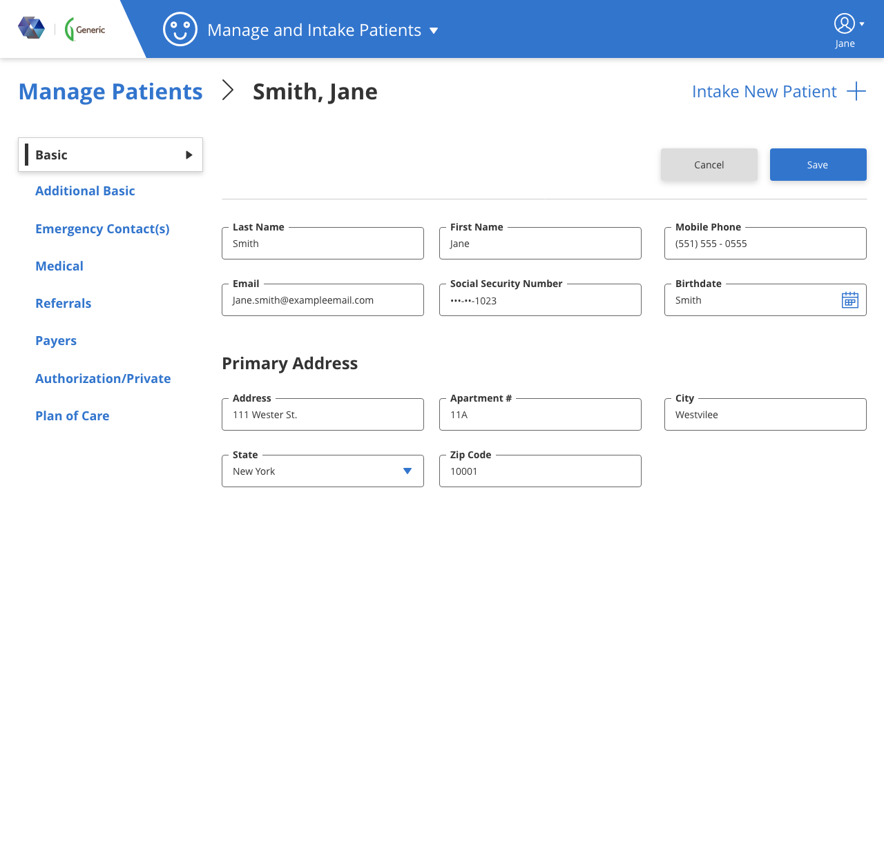
  • Patient System
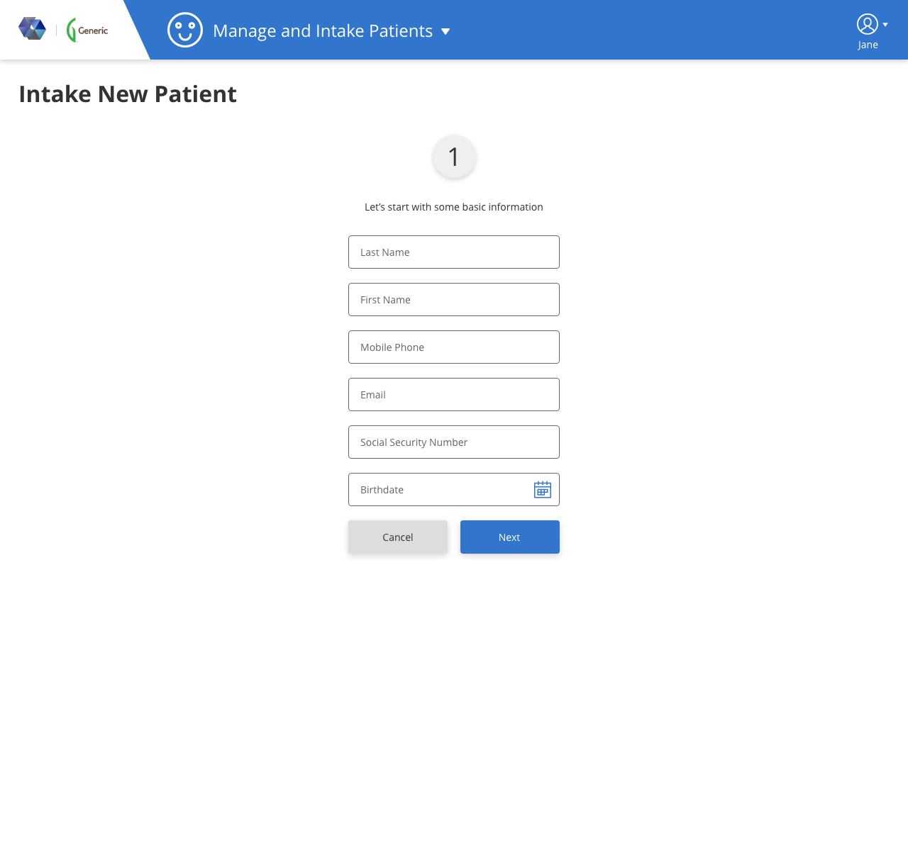
    • A faster, more effective intake process
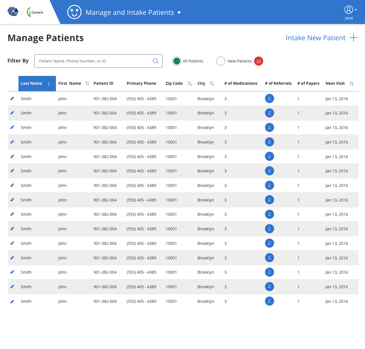
    • Manage and edit patient information
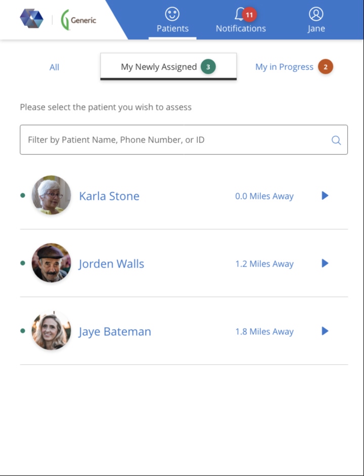
    • Filter patients by name, phone number and ID
    • Search and sort all patient records
  • Scheduling System
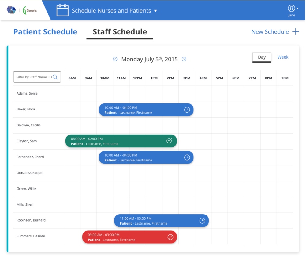
    • Daily and weekly staff schedules at a glance
    • Match patients with qualified staff
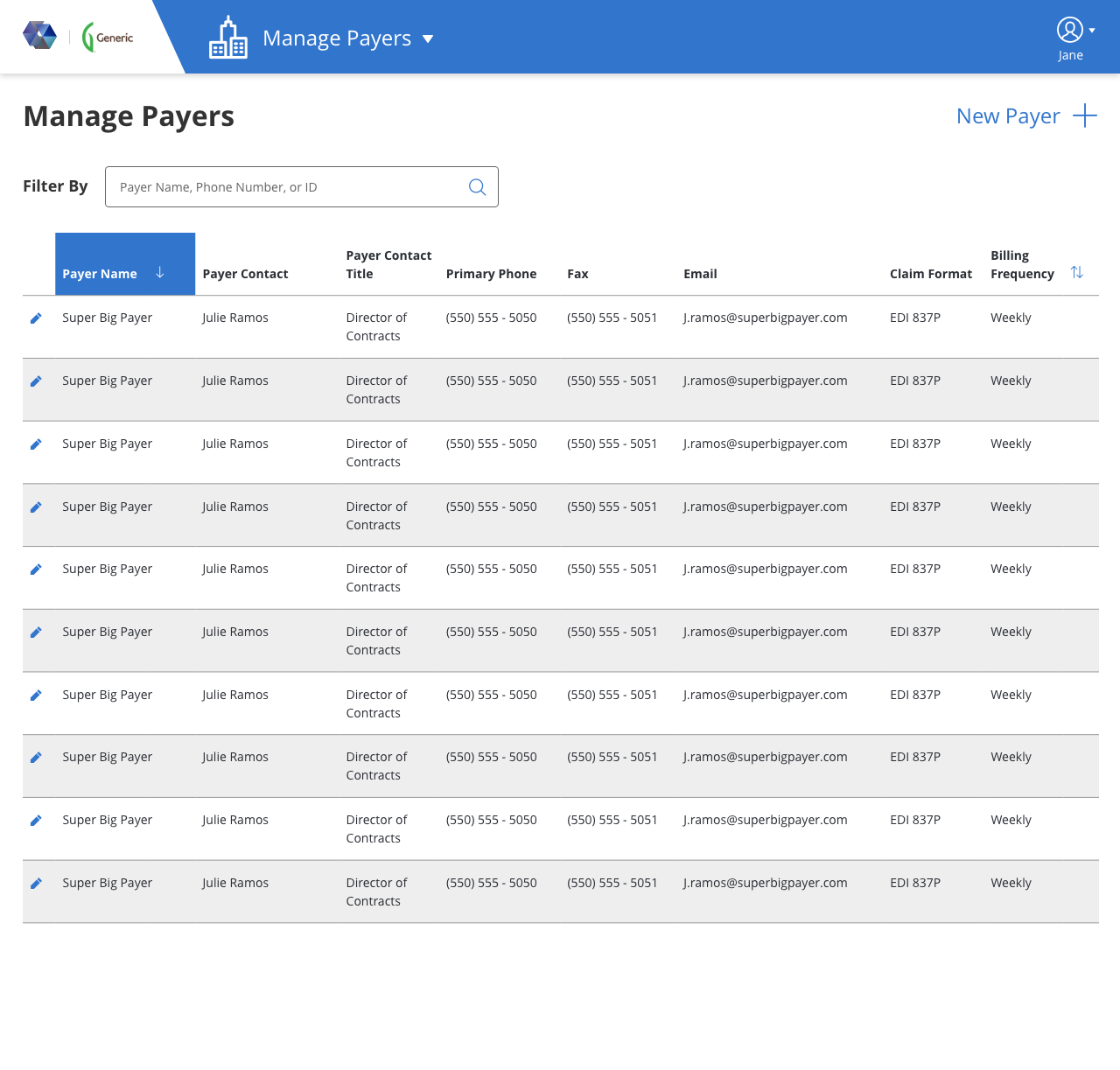
  • Payer Management System
    • Store and intake payer and insurance provider information
    • Search and sort all payer records
    • Filter payers by name, phone number and ID

Information architecture

  • The business analysts and I documented over 100 fields with subject matter experts who knew the existing system and the industry
  • Watching agency staff at work made it clear the fields weren't grouped the way people actually use them, so I reorganized the content around real workflows
  • I capped patient intake groups at six fields to prevent cognitive overload
  • I defined every data point and regrouped the fields by importance, so the required intake steps could be finished as quickly as possible
Sandata Agency Center Intake and Manage Patient Information Architecture
Sandata Agency Center Schedule Information Architecture

User flow

Sandata Agency Center UserFlow General
Sandata Agency Center User Flow Patient
Sandata Agency Center UserFlow Schedule
Process

Hypotheses

Less is faster

Users said the management screen should show as much as possible. Screen size and attention say otherwise, so I asked for their top 10 fields, betting that focus would make them faster

Smaller steps, quicker work

Users expected separate pages to slow them down. I bet that seeing a few fields at a time would speed them up, with full keyboard support from AA compliance

Counts over lists

The client first asked to show every medication, referral and payer. These lists are dynamic and space was tight, so I proposed counts, a quick read that shows which patient records need attention

Innovations

  • Elastic filter

    One flexible filter instead of separate fields.

  • New-patients filter

    Jumps straight to records still waiting for intake, with a count that previews the workload.

  • Learning typeahead

    Suggestions on key fields that learn from everyone's input across the agency.

  • Staff matching

    A matching algorithm that pairs patients only with qualified staff.

Final designs

Visual design

Colors

Data-heavy, so a minimal two-color theme

Dark gray text with a lighter secondary gray: softer than black, easier on the eyes in an information-heavy app

  • #333333
  • #666666

A warm blue accent for calm, because users spend long stretches on repetitive tasks and I wanted to ease that frustration

  • #3275CD
  • #164C94

Typography

Open Sans by Google

Readable and modern, handles numbers and text equally well

Strong contrast between bold and regular weights, so read-only values stand apart from their labels

Buttons

A business look and feel with a small corner radius

At least twice the usual vertical padding, so buttons stand out

PrimarySecondary